This is my second blog regarding my residency at Joya: Arte + Ecologia. The first is here. The background to this is that I was announced as University of Art London's Environment International Artist Residency Programme resident artist at Joya, in eastern Andalusia in southern Spain, earlier this year.
My previous blog explored 'land & environmental art'. I am particularly interested in the relationship between the map and the terrain, and this blog focuses on mapping Joya.
First up, here are Joya's longitude & latitude: 37.763696, 2.070142
Something to set the scene. This article by John Vidal in the Guardian suggests that Murcia province is one of the world's seven most significant climate 'hotspots', and could quickly become a desert with 2 degrees C of global temperature increase. Murcia is 53 miles from Cortijo los Gazquez, the farmstead which houses Joya. The map below, derived from Mark Mulligan's Policy Support Systems operation at Kings College London (KCL), shows how the region around Joya is part of the watershed or cuenca for Murcia. I don't have any comparative data, but we can see that a number of the sources of water for Murcia are providing little or zero accumulated rainfall to Murcia on an annual basis (dark blue = zero rainfall accumulated). This is a problem because the Murcia / Alicante region already sees less rain than the Vélez-Blanco, the province where Cortijo los Gazquez is located - see the next map, also derived from Policy Support Systems at KCL.
Rainfall accumulated down flow lines, mm3/yr, Almeria and Murcia regions, Southern Spain. Dark blue = zero rainfall accumulated; bright yellow = 3700mm3/year. Source: derived from Policy Support Systems, Mulligan and Burke, Kings College London.
Total wind-correct rainfall (mm/yr). Source: derived from Policy Support Systems, Mulligan and Burke, Kings College London.
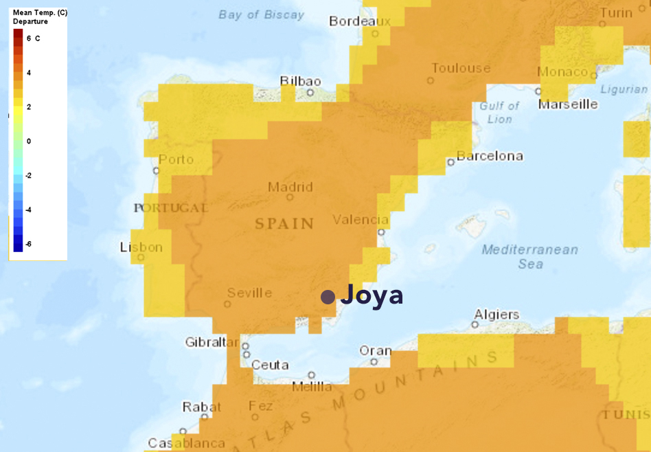
The below maps from www.climatewizard.org shows that the area around Joya has already seen a yearly change in temperature between 1951-2002 (right hand map - the left hand map shows the average temperature in the region), whilst the subsequent, larger map shows that most of the Iberian peninsular is expecting between 2 and 4 degrees climate change over the next 60 years. The final two maps, side-by-side, shows how there is expected to be a reduction in rainfall (right hand map), upon an already dry area (left).
Composite image of climate data from www.climatewizard.org. Left map shows Average Annual Temperature 1951 - 2002 (degrees C); right map shows Change in Annual Temperature 1951 - 2002 (degrees C/year). Source: www.climatewizard.org
Change in Annual Temperature by the 2080s (degrees C). Source: www.climatewizard.org
Composite image of climate data from www.climatewizard.org. Left map shows: Average Annual Precipitation 1951 - 2002 (mm) Right shows: Change in Annual Precipitation by the 2080s (% change). Source: www.climatewizard.org
The World Resources Institute produce the Aqueduct Water Risk Index, and the below extract shows that south-east Spain has an extremely high baseline level of Water Stress, defined as "the ratio of total annual water withdrawals to total available annual renewable supply, accounting for upstream consumptive use". However, there is an important nuance to this metric. The subsequent map shows "Overall Water Risk", defined as identifying "areas with higher exposure to water-related risks and is an aggregated measure of all selected indicators from the Physical Quantity, Quality and Regulatory & Reputational Risk categories". In this map, we see that the area around Joya has a lower Water Risk than it does Water Stress. The reason is that Water Stress is only a contributing factor to overall Water Risk. As the hierarchy chart to the left of each map shows, overall Water Risk is also affected by other factors which include variability, upstream storage, groundwater stress, upstream protected land regulatory and governance factors. In other words, Water Risk is not just determined by the environmental 'in-out' equation - there are other mediating factors, which include those determined by people and society.
Baseline water stress measure of Spain and parts of north-west Africa. Location of Joya is shown by black marker. Source: Aqueduct Water Risk Atlas, World Resources Institute.
Overall water risk measure of Spain and parts of north-west Africa. Location of Joya is shown by black marker. Source: Aqueduct Water Risk Atlas, World Resources Institute.
The analysis shows that environmental risk factors are mediated by people and the decisions we make. A scientific term for this is adaptive capacity. I've briefly written about this before, and the image below is a composite of three maps produced by ESPON, the European Grouping on Territorial Cooperation. The middle map is perhaps the most familiar in climate circles, and shows the aggregate potential impact of climate change in terms of the environment, economy, society and culture. It is based on exposure to climatic change, and compares 1961-1990 and 2071-2100 climate projections. The left map shows 'overall capacity to adapt to climate change', a metric which is calculated as weighted combination of economic capacity (weight 0.21), infrastructural capacity (0.16), technological capacity (0.23), knowledge and awareness (0.23) and institutional capacity (0.17). Essentially a richer area, with better infrastructure, institutional capacity, technological capacity and knowledge, will adapt to climate change better than a poorer area without those assets. The right hand map shows 'potential vulnerability to climate change'. This is a more sophisticated analysis than either the 'potential impacts' map or the Climate Wizard maps above. It applies the layer of analysis in the adaptive capacity map to the impacts map, to see how vulnerable a region is to climate change.
What I take from this is: we can't understand climate change without understanding people and the decisions they make. This applies to the decisions that people and society make about addressing climate change through targets and commitments, through to the decisions made at the local level which affect how vulnerable an area is to climate change. Jared Diamond, in his book Collapse, describes five sets of factors which affect a society's ability to survive and prosper in an environment: environmental damage, climate change, hostile neighbours, friendly trade partners and - crucially - the society's response to environmental factors. The sub-title to Diamond's book is significant: How Societies Choose to Fail or Succeed. This reminds me of Simon Beckmann's research on the ephemeral systems (Sistemas Efímeros) in the Andalusian countryside. Beckmann, through visual research, ethnographic research and interviews with former countryside dwellers (now living in towns), and collaboration with hydrologists, has identified that water management practices dating back to the Bronze Age have fallen out of use, and this could be as important for understanding the aridity and erosion of the local ecosystem as is climate change.
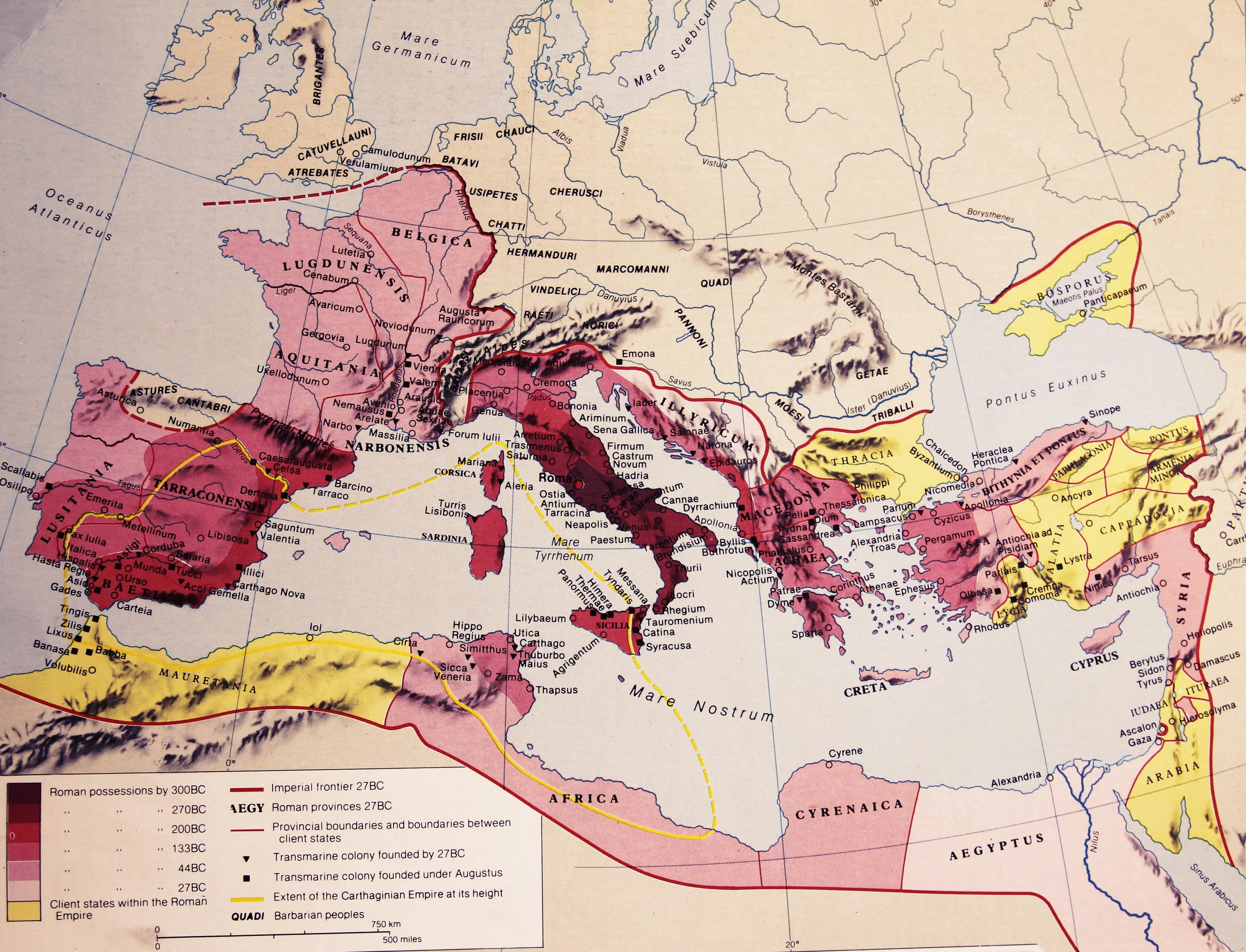
This insight, linking the success of current agricultural practices to the societies of the Bronze Age Iberian Peninsular, prompted me to investigate the rich social and political history of the region. The 1981 Hamlyn Historical Atlas by R.I. Moore is a beautiful collection of detailed maps from a time before the word 'infographic' existed. The exerts below shows Southern Spain was subject to an array of important influences and cultures between the late Bronze Age and the end of the fifteenth century, the completion of the Christian conquest of the Peninsular.
Phoenicians and the Greeks. Source: R.I. Moore (1981) Hamlyn Historical Atlas.
The Growth of the Roman Empire. Source: R.I. Moore (1981) Hamlyn Historical Atlas.
The Islamic Empire. Source: R.I. Moore (1981) Hamlyn Historical Atlas.
We can bring this analysis up to date with an analysis of population change and movement in contemporary Spain. The Spanish newspaper El Español has run a great data visualisation of current population change in Spain, as part of their Spain in Numbers feature. The data shows that much of the region in southern Spain, including the Vélez-Blanco municipality, are seeing a decline in population numbers (left hand side of map below). This may be linked to the lack of employment opportunities (right hand map). Either way, it fits with the narrative hinted in Beckmann's work and the adaptive capacity maps, that a declining rural population is leaving the land vulnerable to environmental change.
Left: population variation in Spain between 2011 and 2014; Right: variation of the unemployment rate by municipalities estimated for the months of March 2011 and March 2015. Source: El Español, Spain in figures


